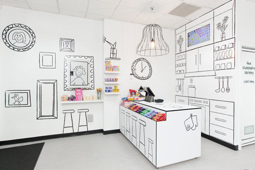
Being strongly influenced by the idea of designing a playful, simple and somewhat illusional space for the Candy Room, the exaggeration of a 'room' idea was formulated. The application was to use line artwork on white space to represent a room.

Sweet Enough is an importer of sugar free candy products selling to stores across Australia including major department stores Myer and David Jones.

Following their success in the wholesale market, Sweet Enough decided to enter the retail market, approaching Red Design Group with a brief for a store that had to be edgy, humorous and uniquely charismatic. It was not to be simply a shop; it had to be a destination and an experience.

Their new venture 'The Candy Room', located in the heart of Melbourne's CBD has a design that toys with the concept of illusion and draws the inner child out of the customer using a strong connection with childhood, fantasy, fiction and of course, sweets.
Being strongly influenced by the idea of designing a playful, simple and somewhat illusional space for the Candy Room, the exaggeration of a 'room' idea was formulated. The application was to use line artwork on white space to represent a room. Sweet Enough is an importer of sugar free candy products selling to stores across Australia including major department stores Myer and David Jones. Following their success in the wholesale market, Sweet Enough decided to enter the retail market, approaching Red Design Group with a brief for a store that had to be edgy, humorous and uniquely charismatic. It was not to be simply a shop; it had to be a destination and an experience.

Their new venture 'The Candy Room', located in the heart of Melbourne's CBD has a design that toys with the concept of illusion and draws the inner child out of the customer using a strong connection with childhood, fantasy, fiction and of course, sweets. Being strongly influenced by the idea of designing a playful, simple and somewhat illusional space for The Candy Room, the exaggeration of a 'room' idea was formulated. The application was to use line artwork on white space to represent a room.

Everything including the fixtures is painted in white, while graphically applied line artwork produce the suggestive elements of a room – A kitchen splashback is drawn complete with a boiling pot on the stove or a framed portrait of one of the kids. Red Design Group was also responsible for the branding and all the packaging throughout the store. Allowing the space to be predominately white allowed the colors of the confectionery to dress the space. In a sense, the interior design for the Candy Room creates a fantasy and experience of a room without creating one.


